Introduction
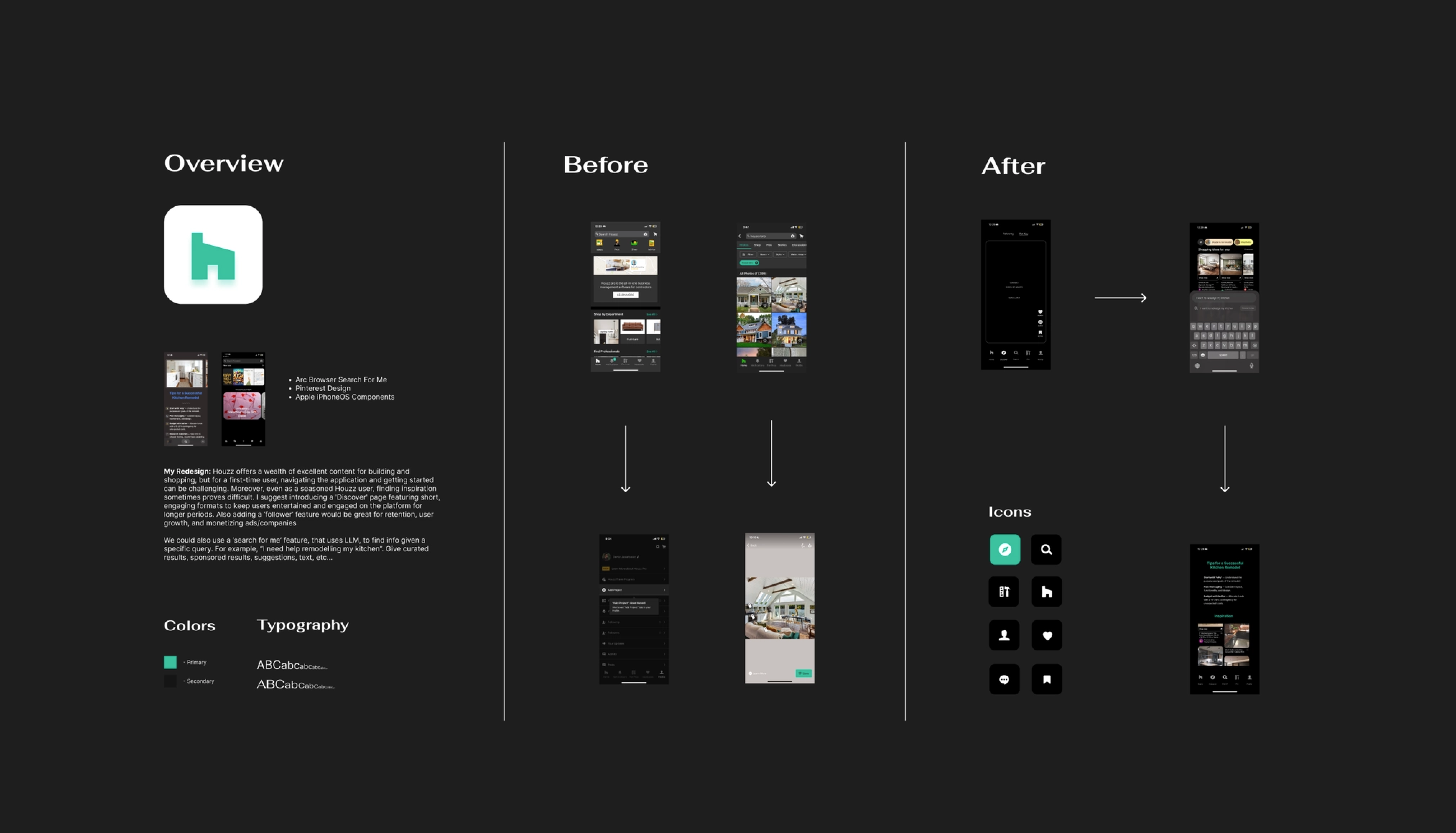
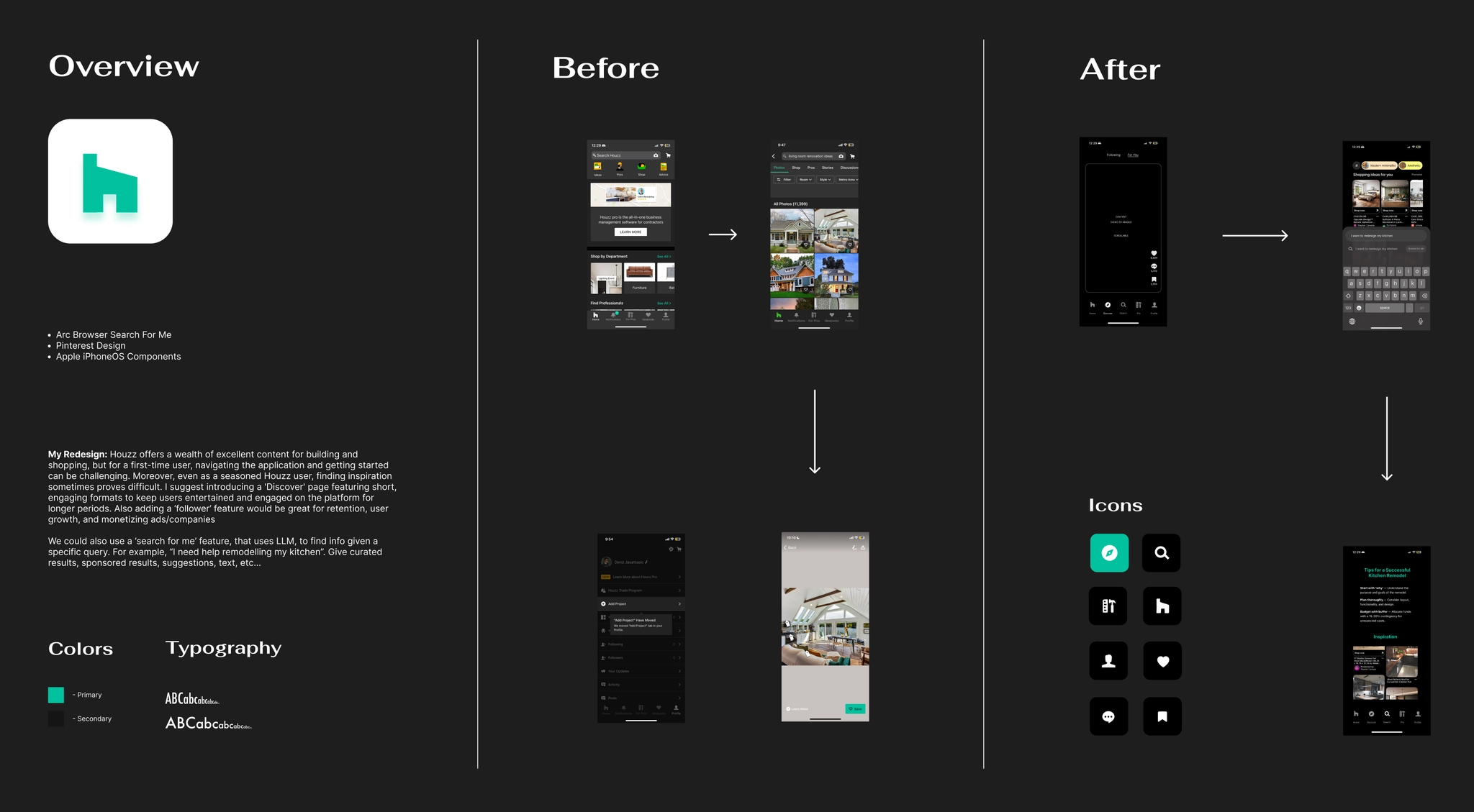
Kleiner Perkins has a design fellowship program, as part of the application process, candidates redesign a product from their portfolio. I focused on a company whose product I knew pretty well: Houzz, a platform I've used for home design inspiration and project planning in the past. Drawing from my own experience and feedback from family and friends who have also used the app, I redesigned the Houzz mobile experience to modernize its content discovery and search.
This is a case study for the Kleiner Perkins design fellowship. I am not affiliated with Houzz.
Curated Search Experience
Houzz offers a wealth of resources for home design, inspiration, and shopping, but new users often struggle to navigate the mobile app and get started on a project. Even as a regular user, I sometimes find it hard to quickly find what I'm looking for or know where to begin.
Current Design:
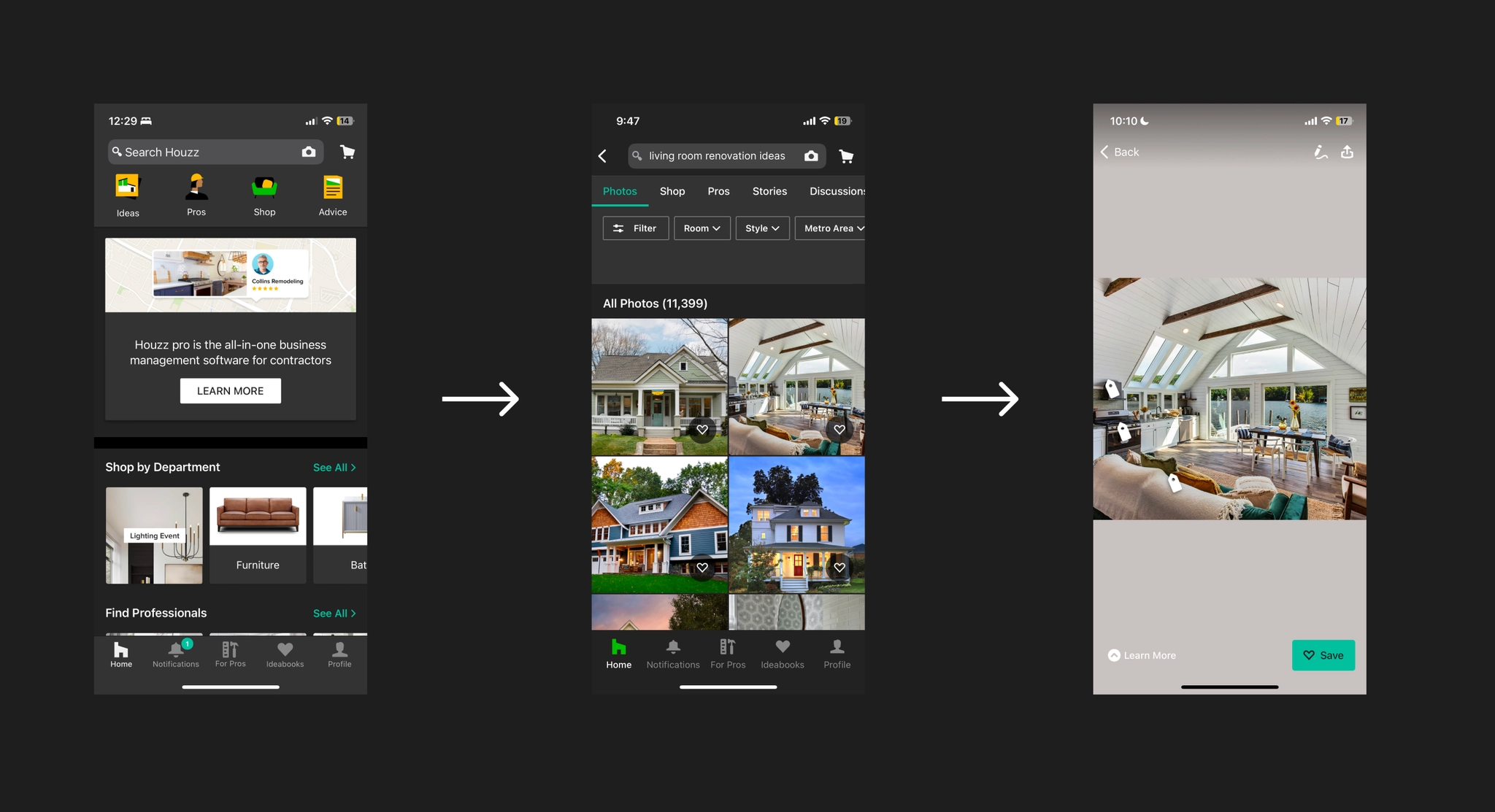
The current flow from search to results for a simple task like "Living Room Reno" can be overwhelming, with over 11k images and an uninspiring save feature. As a user, where do you even start?
This is a perfect use case for LLMs. A technology that can understand a detailed prompt about exactly what you're looking for and build a curated foundation of ideas and resources. I was inspired by a feature I recently used called "Browse for Me" in Arc. If you're unfamiliar, Arc is a browser made by The Browser Company of New York that is pushing the boundaries of how we interact with the web. It has been heavily adopted by developers and designers, and is constantly shipping cool features that change how we search and browse daily.
I wanted to create a similar experience that goes further: tailored results that learn as you search, support for multiple input types like reference images or videos, automated project collections, and more. Think of it as a personal assistant that gathers, saves, and presents exactly what you need. Type something like "I need help remodeling my kitchen" and instantly get curated media, text suggestions, and a head start on your project.
No more manually saving photos, taking notes in external apps, or spending hours researching across tabs. Houzz is now the operating system for everything home related.
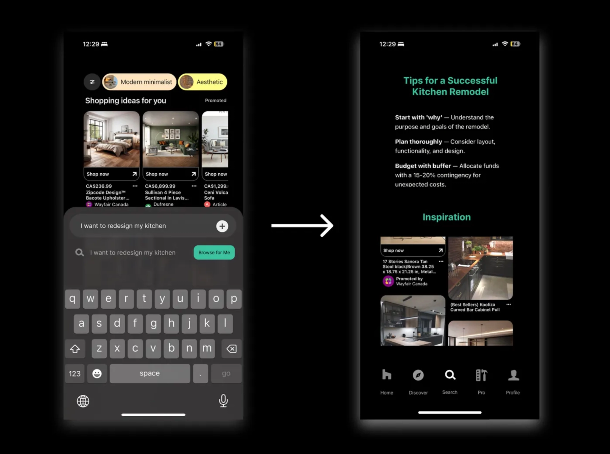
Find curated content, advice, and key resources within a few clicks!
If you still prefer traditional search, it remains fully available. This feature sits on top of it as an opt-in layer, designed for users who want a more personalized experience without disrupting the existing one. Beyond improving the user experience, it also opens up new monetization opportunities for Houzz, from sponsored results to helping users find products and resources they actually want, faster.
Better Content Discovery
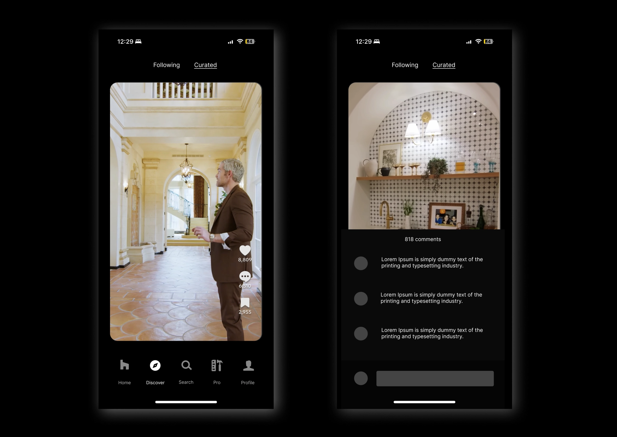
The current content experience feels static and uninspiring, so I redesigned the Discover page, drawing inspiration from TikTok, Instagram Reels, and YouTube Shorts.
You might wonder why a home planning app needs social media-like features. The goal is simple: sustain curiosity, increase engagement, and unlock new revenue opportunities. Short-form content isn't just a trend, it's a proven strategy for driving retention and growth in an era where attention spans are shorter than ever.
The numbers back it up. Since introducing YouTube Shorts, monthly active users grew from 1.5 billion in 2022 to roughly 2 billion by end of 2023, with around 80% of users watching Shorts regularly. Users are also 1.5 times more likely to make a purchase after discovering content in this format. For Houzz, this means more time in the app and less invasive, more natural revenue through ads, partnerships, and premium services.
Sources:
- The Impact of TikTok User Satisfaction on Continuous Intention to Use the Application
- Creating Online Videos That Engage Viewers — MIT Sloan Management Review
- Alphabet 2023 Annual Report
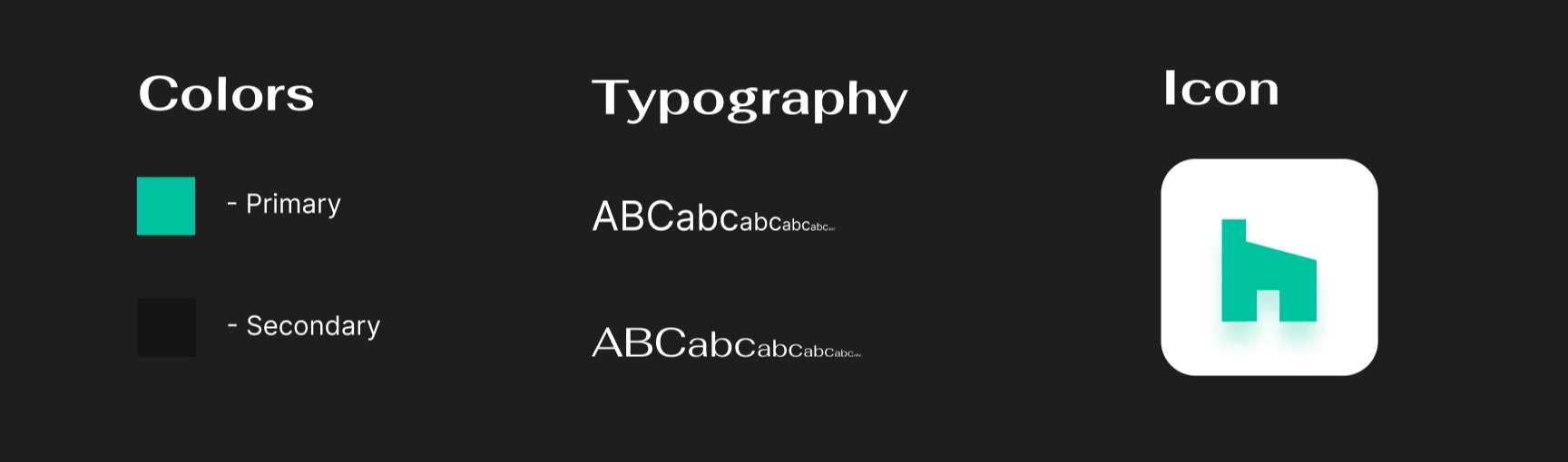
Branding Refresh
I also refreshed the branding with a brighter, more eye-catching mint green (#00C29E) while keeping the brand's Futura font family. The app icon got a glow-up too, featuring a halo effect that helps it stand out on a crowded home screen.
Design Board:
I used Figma throughout the entire process, from brainstorming and gathering inspiration to building high-fidelity mockups. I explored different design concepts, focusing on layout, typography, and visual hierarchy to keep the interfaces clean and the experience intuitive.
View Figma File — KP Fellowship Design Challenge
Conclusion
In this case study, I explored ways to modernize Houzz's mobile UI and UX, integrating features like short-form content and LLM-powered search. This project was a great opportunity to grow my passion for product thinking and design, and I was fortunate to be a finalist for the fellowship. Grateful for the process and everyone who reviewed my work.
Through the essay applications, case study, creative video submission, and everything in between, I learned a lot about myself and my passion for design. I'd highly recommend all students apply to VC fellowships. There are many great ones out there, like Thrive Capital and Kleiner Perkins. It's a great way to learn, and who knows, you might even get the chance to work with one of the amazing startups these firms help build.
Hope you enjoyed this case study. Feel free to fork the Figma file, use any of the design resources, or draw inspiration from the work :)